A big shout out to those who expressed appreciation of my blog’s new look. It was actually a project I’ve listed for 2015 but kept putting off because I couldn’t decide on the final details.
For sure, I wanted less colors na for the blog. Not that I didn’t like the “Cath Kidston / tea party” look that defined The Bright Spot for the past 2 years (read about that makeover HERE), but I noticed that most of my pictures have color tones of brown and other earthly shades, and that these are not consistent with my blog’s overall color palette of light and pastel shades.
So I observed how other blogs built up their website design, identity and photos through the colors they used, and I found myself drawn to those who used their colors consistently.
A good example is Patricia of Fancy Girl Design Studios who successfully used colors (of black, white, gold and shades of pink) to define her brand. Her photos are not only visually appealing, but carefully curated so that they are consistent with the overall look of her website. Even her Instagram feed is amazingly pretty and is an extension of her blog’s color palette. I wish I could do something as perfect as this.

But I am not even near to doing that (and nowadays I am lucky if I am able to update the blog at least once a week). So I decided to just address the color scheme ‘issue’ to achieve some consistency at least. I contacted Patricia (yes, the one with the enviable website design above hehe who also did my blog’s previous makeover) and asked if she can fit me in her tight schedule. It took a while before we finally worked on this, in part because I haven’t really decided on the colors and other details for my blog’s new look.
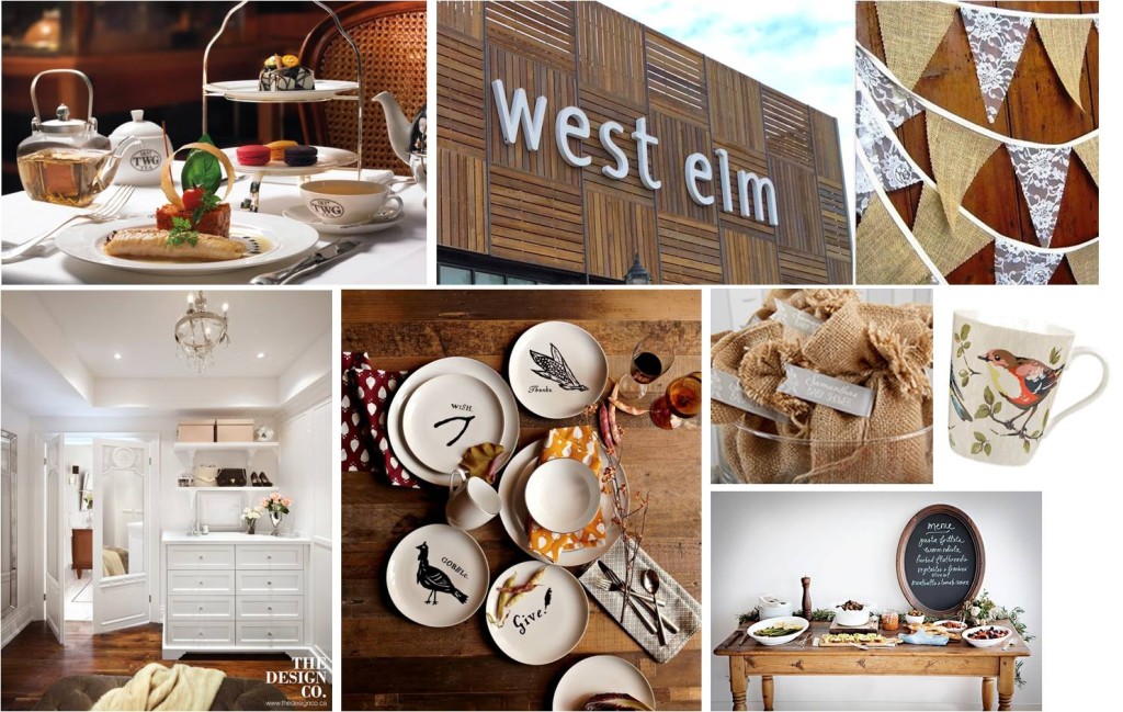
The number of Tagaytay trips we had this year made me decide on a rustic modern look for The Bright Spot v.2. After seeing the newest branch of Bag of Beans in Tagaytay, I knew I’ve found the look I wanted.
So my mood board was filled with warm shades of brown and clean white (more “natural light”, so to speak). I asked Patricia to add details of flowers and birds, because I still want some Cath Kidston-feel here.
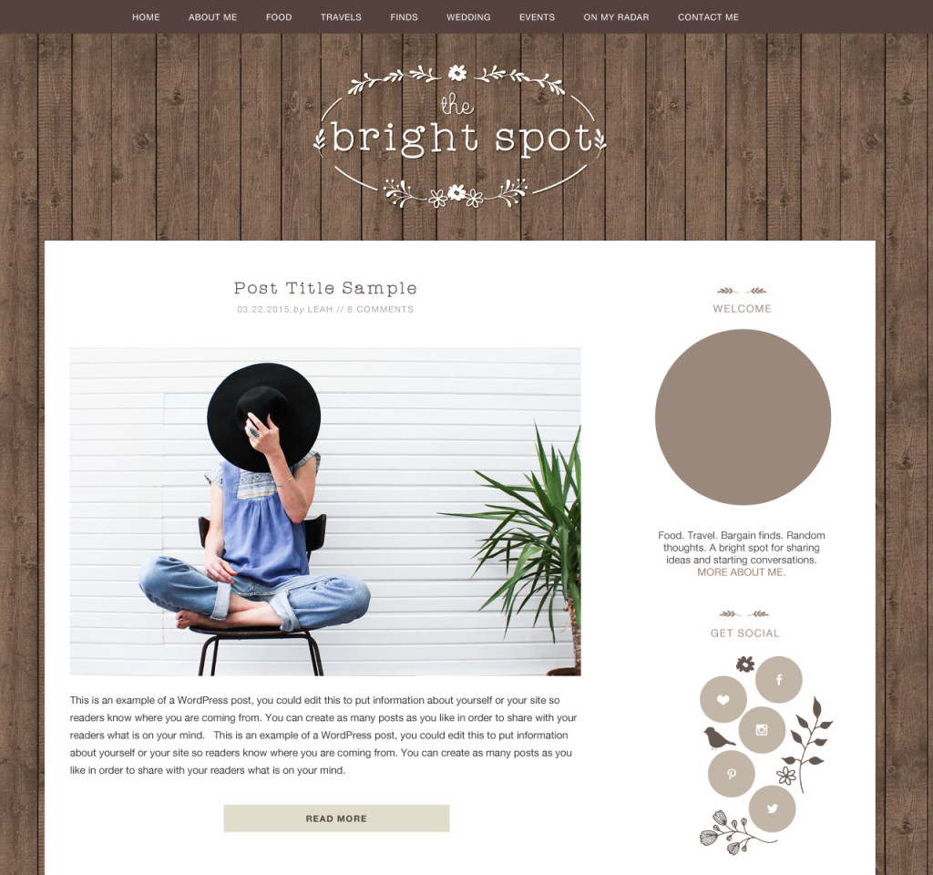
I specifically asked for the sidebar icons to be round and if possible, arranged like the plates above. And the fonts need not be cursive anymore – I wanted simple, clean fonts as well.
Here’s the new design she created for me. Every detail is perfect.
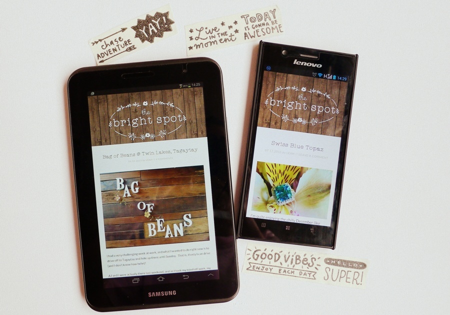
And here’s how the new look is displayed in tablet and mobile phone. Much better, right?
I hope you’re enjoying it as much as I do. I feel that with this new color, brown, to welcome you – you will see more orderliness here, and a feeling of relaxation and warmth.
I intend for this blog to remain as “all natural” and “organic” as possible (like what its new color symbolizes): with minimum dose of advertorials (and I make sure they are interesting not only to me, but you as well), and a readership built in an organic way (not just because of contests, round-the-clock updating in Facebook, Instagram, etc.). I prefer taking it slow and nice.
Oh, don’t be surprised too if the new color scheme stimulates appetite for chocolates! (Aggie said the blog’s new colors makes her think of dark chocolates, yum!) I have to admit I am more tempted now to write about and post pictures of chocolates (and coffee!) because they do look good with the earthly colors of the blog!
So there, welcome to my new home and enjoy your stay! =)


Congratulations on the new look! May this inspire you to share your amazing stories.
Thank you, Ms. Kay!
Oh Leah, this is lovely! 🙂 love it! 🙂
Thank you, sis Marj! How are you?? Post more pics of you and Yui please =)
Finally, the story behind the new blog look! 😉 I really like how the sidebar icons are not conventionally arranged. They feel more… IDK, fluid?
This particular shade of brown is very nice and warm. Although dark chocolate talagang *unang* naiisip ko, pwede rin ang coffee, a log cabin, pottery, autumn…. 😉 No color evokes “nature/earth” as strongly as brown. I think it would go well with your Cath Kidston florals and Pip Studio birds.;-) I am not a color expert, but a good rule I follow is that if the color combination can be found in nature, it is sure to work! 😉
Keep the posts coming! 🙂
Thanks Aggie! =)
Uy, chocolate brown yung wedding theme nyo di ba? 😉
Yes Aggie! Another good reason for my color choice hehe!
beautiful Leah
Thank you!
I like the new look of your blog, Leah! Ang linis at ang minimalist pa. 🙂
Thank you Edel! =) Labor of love yan haha!
I so love this new look! Though no matter what design your blog has, I will always be a fan. Keep the posts coming!
Thank you, Mommy Marie!
Hi Miss Leah
The new look us really beautiful
It’s so you..im always looking forward on your new post..keep it up
Thank you, Jessica!
First time to comment but been following your blog for awhile now 🙂 It really reminds you of chocolates! Ganda!
Thank you Mommy Kach and welcome to The Bright Spot!