There is something about blog logos that really interest me. In fact, that’s the first thing you will see every time you “open up” a blog. It’s like the cover sleeve of a book. If a cover sleeve has a really cool illustration or typography, it will attract a reader’s attention. Never mind if the book’s title is nondescript, but a cool illustration or typography will almost always get the reader’s attention, then invite him/her to open a few pages and read through them.
It was this analogy that made me decide to finally have someone design me a blog logo. I really love Isabel Gatuslao‘s designs, but there’s no way I can afford her. Typography is her forte and she designs like an architect, so the results are always clean, minimalist and yet personal – something I initially wanted as a concept for my blog logo.
But as I went blog hopping – checking out personal blogs, mommy blogs, wedding blog and food blogs, to count a few – I realized that what I really want is a logo that speaks of cheerful, home-y and very pleasing to look at.
After looking at countless more blog sites, I came upon the works of Patricia, who is the graphic designer behind some of the popular blogs like Dainty Mom and The Misis Chronicles – blogs with templates that I really envy (next to Daphne’s, of course).
I liked Patricia’s works so much that I immediately sent her an email last weekend. She responded promptly to my inquiry and I was happy that she doesn’t charge so much for a blog logo (with free blog badge). I closed our deal the following day and then she sent me a questionnaire about my design preferences and ideas.
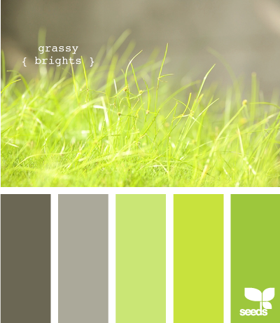
Choosing the color palettes of my blog logo was the last step in the design process and this proved to be enjoyable! I thought I’ll never have a hard time on this because I’ve already identified my color choices as apple green, dark grey and black, but Patricia made me check the Design Seed for the actual color palette, and I was floored at the many shades of green, grey and black to choose!
After looking at each palette for close to 30 minutes, I chose the grassy bright palette. The colors are perfect and it’s also close to my blog name hehe.
Based on the answers I gave and the color scheme I chose, Patricia came up with this:
I loved it the first time I saw it! To be sure, I asked Patricia to make a second copy with a different font but we still both liked the first on and sticked with it.
I hope you like The Bright Spot’s logo as much as I do. Doesn’t it remind you of a bright and happy spring everyday?
Thanks Patricia! You’re such a fast worker – can’t beat that!
See more of Patricia’s works and check out her other graphic design services at Works of Art by Pat.


so glad you like it, leah! =) i had fun working on your design.
I am also planning of having my site dressed up by her. However, I can’t do it just yet because there are some other stuff I have to purchase and configure in one of my wp sites. I am so envy you already had your own. Lol.
Patricia is really a talented designer… Thank you for sharing with us your wonderful experience. <3