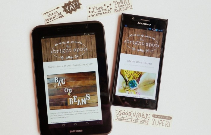
A big shout out to those who expressed appreciation of my blog's new look. It was actually a project I've listed for 2015 but kept putting off because I couldn't decide on the final details. For sure, I wanted less colors na for the blog. Not that I didn't like the "Cath Kidston / tea party" look that defined The Bright Spot for the past 2 years (read about that makeover ... READ MORE
Finally, my own blog identity
There is something about blog logos that really interest me. In fact, that's the first thing you will see every time you "open up" a blog. It's like the cover sleeve of a book. If a cover sleeve has a really cool illustration or typography, it will attract a reader's attention. Never mind if the book's title is nondescript, but a cool illustration or typography will ... READ MORE
