Last year, it was a new blog logo for The Bright Spot:
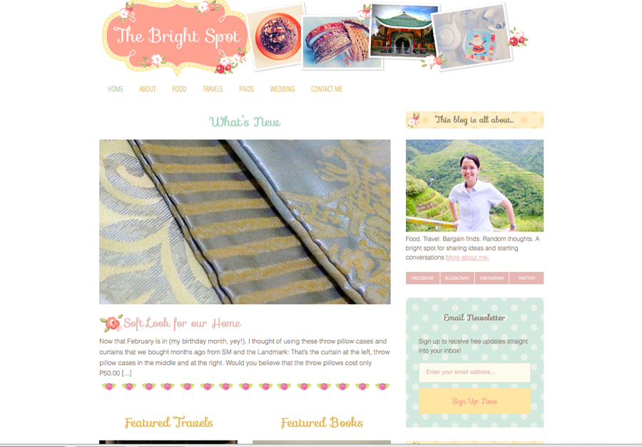
Then barely a year after it was a total new look for The Bright Spot!
What made me do it?
It’s simple: my blog is growing – not exactly in terms of readership (not yet, anyway) – but in terms of the number and variety of contents that I’ve put in. I felt that it needed to have its own identity, one that will define what it is all about.
My blog started as a journal of sort for my wedding preparations way back in 2011 (I was still using Livejournal then), and soon it became a scrapbook where I happily fill in each page with pictures and stories and memories of my food trips and travels with AJ (and sometimes, for work); pictures and captions of my shopping finds; as well as snippets of my simple life. And just when my ‘digital’ scrapbook was becoming thicker, Livejournal experienced intermittent downtimes in the middle of 2011 and the worst was when I cannot access my blog for 3 straight days. That episode sealed my move to WordPress.com, also in 2011.
The adventure continued at WordPress, where I started to write about my attempts at becoming a domestic goddess: cooking for the first time (I never ‘seriously’ cooked when I was single), trying and sharing new recipes, documenting home projects for our apartment as well as my DIY/craft projects. I’ve also thrown in some cleaning tips, in case you’re interested.
Along the way I discovered photography, and I am happy that WordPress.com has these really amazing and ready-to-use themes for picture albums. I was writing more frequently too and best of all, I finally have readers, hehe!
Then I started reading about this ultimate tool in publishing platform: WordPress.org. The benefits and flexibility it offers just floored me. I read tons of reviews comparing this with WordPress.com, its pros and cons, and here are its 4 winning benefits:
- You have more freedom and creativity in blog design. You can customize your blog design, choose your own colors and fonts and layouts and widgets. That is exactly what I was craving for.
- You can maximize the functionality of your blog. Have you heard of plug-ins? These are little applications that give added functions to your blog like search engine optimization (SEO), social media sharing and ads display. There are also other customization tools available as plugins. They are easy to install and can be activated in a single click.
- It’s easy to use! This is especially true for WordPress.com users. Both have similar admin panels so navigating around WordPress.org won’t be difficult.
- It’s free. That’s the best part =)
The only downside was that I have to have a self-hosted blog to be able to use WordPress.org.
Ultimately, it’s the freedom to execute my own ideas in the blog design which cemented my decision. I have looked at so many blogs already, and I am always drawn to those with pastel-colored themes and vintage, shabby chic feel. I really wanted to have those, too.
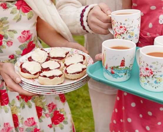
Obviously, the new look of the blog has to be inspired by these: Cath Kidston (dainty colors + cute florals) and English afternoon tea.

Just relaxing and happy to look at, isn’t it?
Finally, last January, I reconnected with Patricia of Fancy Girl Designs and inquired about her basic website design package. Patricia was my only choice because she’s also the one who designed my blog’s initial logo. I am confident that she will be able execute my “grand” ideas well. And you know what? I was very surprised to find that I can afford her blog design services pala! Geez, what took me so long??
And that began my move to a self-hosted blog and Patricia designing the new look for the blog, based on my design preferences and ideas. I will leave out the technical details for now and focus on the design first.
I wanted the new look to remind me of a “tea party” and Cath Kidston prints. Patricia made sure that you will see all those inspirations in my customized theme: cute floral borders, polka-dot prints for the sidebar titles and tea-cup shape for the logo frame.
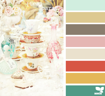
Then, there’s the color palette. This was my favorite part of the design process. Patricia asked me to again head to Design Seed and choose my preferred color palette for the blog.
This was my instant favorite:

I specifically requested that no dark, bold colors be used in the customized theme because I want my blog to look clean and feel light.
It took less than 2 weeks for Patricia to come up with an initial design, and there were just a few revisions made before the final layout was approved and signed off by me.
The new design was exactly as I envisioned it and much more! It was perfectly executed according to my specifications; the colors are perfect and those floral borders are so darn pretty!
The Bright Spot’s new look went live last February 5 – a day before my birthday =) The timing couldn’t be more perfect. What a sweet birthday gift!
Thank you so much, Patricia! You are truly talented and is very, very helpful too. Thanks for staying with me every step of the way – until I got everything right =)


i am in love with the new look!
im apologizing in advance. kukulitin kita one of these days on how to move to a self hosted blog.
congrats!
No problem, mommy Maqui! Can’t wait to share the details with you. I still have some details left out there like how to transfer to your own web hosting site. Will write about that soon!